Some ideas for implementing CSS transition changes from left to right

Introducing some transition tips that seem simple but are not so easy.
Many CSS properties actually do not support transition changes, such as alignment in flex.
justify-content: start | center | end- 1.
Or text alignment.
text-align: left | center | right- 1.
In this way, there is no transition animation when the attribute changes, but sometimes such animation is needed, such as the following effect:
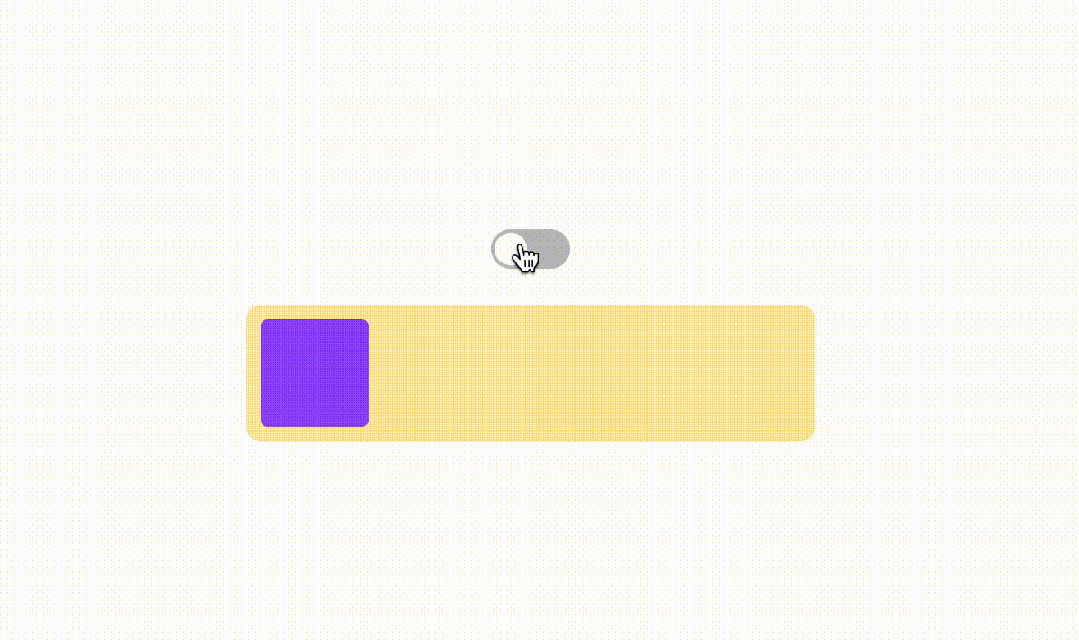
Some people may think that this is just an ordinary displacement animation. Isn’t it enough to give a fixed displacement? But this displacement distance is actually not fixed and changes with the external container. How should this be achieved? Here are some ideas.
1. Positioning + Offset
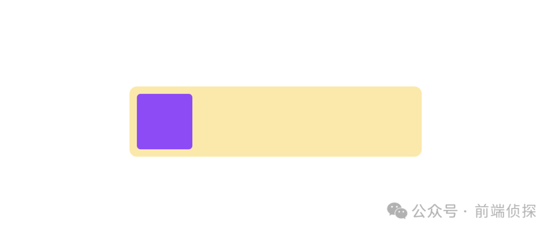
First, let’s briefly illustrate the layout:
<div>
  <div></div>
</div>- 1.
- 2.
- 3.
Add some polish.
.con{
  width: 300px;
  border: 8px solid transparent;
  background-color: #FFE8A3;
  border-radius: 8px;
}
.item{
  width: 60px;
  height: 60px;
  border-radius: 4px;
  background-color: #9747FF;
}- 1.
- 2.
- 3.
- 4.
- 5.
- 6.
- 7.
- 8.
- 9.
- 10.
- 11.
- 12.
Now the effect is as follows, so how to move smoothly from left to right?
Since conventional alignment cannot be achieved, is it possible to achieve alignment in another way?
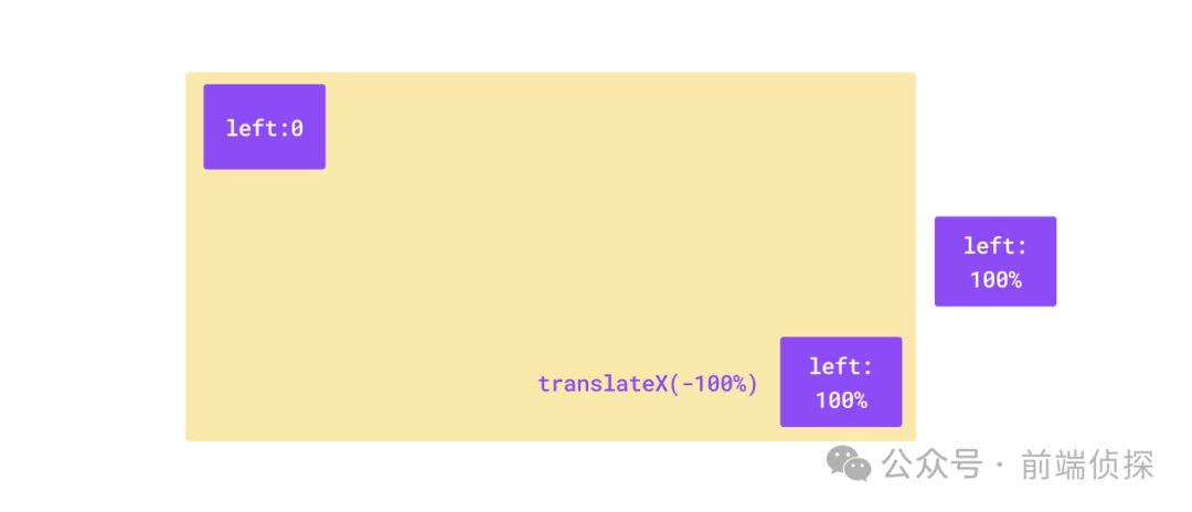
When it comes to alignment, it's easy to think of positioning. For example, the default is left:0, and the right position is left:100%.
.item{
  position: relative;
  left: 0;
  transition: .2s;
}

/* 变化后 */
.item{
  left: 100%;
}- 1.
- 2.
- 3.
- 4.
- 5.
- 6.
- 7.
- 8.
- 9.
- 10.
The dynamic demonstration is as follows:

You can see that the element has gone out after left:100%. Because the 100% offset here is relative to the parent, in order not to go out, it needs to be corrected to make the element translate its own width to the left. You can use translate here. , which happens to be relative to itself.
.item{
  position: relative;
  left: 0;
  transition: .2s;
}

/* 变化后 */
.item{
  left: 100%;
  transform: translateX(-100%);
}- 1.
- 2.
- 3.
- 4.
- 5.
- 6.
- 7.
- 8.
- 9.
- 10.
- 11.
That is to say, the smooth transition from left to right needs to be completed through the change of two attributes, as shown below:
This is more perfect.

You can also visit the following link to view the effect:
- CSS align transition(position) (juejin.cn)[1]
Of course, in addition to relative positioning, margin-left is also possible.
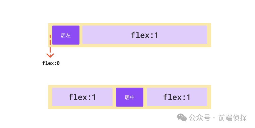
2. Flexible layout extrusion
In addition to the above positioning offset method, it can also be implemented using flexible layout. Here we take flex as an example.
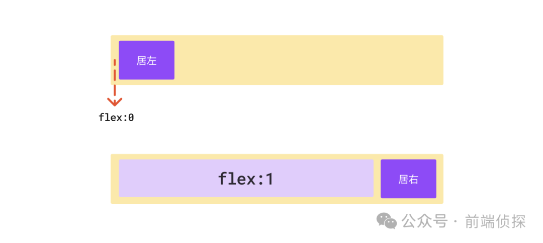
You may have used attributes such as flex:1 to fill the remaining space. What if it is flex:0? It means that the fill ratio is 0, which means it takes up no space. So through the extrusion of the elastic layout, is it also equivalent to changing from the left to the right.
The change of flex supports transition, so the left and right transition effects can be easily achieved.
Still in the previous layout, we can use the pseudo element::before to act as an extruded element.
.con{
  display: flex;
}
.con::before{
  content: '';
  flex: 0;
  transition: 1s;
}

/* 变化后 */
.con::before{
  flex: 1;
}- 1.
- 2.
- 3.
- 4.
- 5.
- 6.
- 7.
- 8.
- 9.
- 10.
- 11.
- 12.
- 13.
The actual effect is as follows:

Isn’t it also easy? You can also visit the link below to view the effect.
- CSS align transition(flex) (juejin.cn)[2]
By the way, if you want to achieve the effect of moving from left to center, you can use two pseudo elements. The principle is similar.
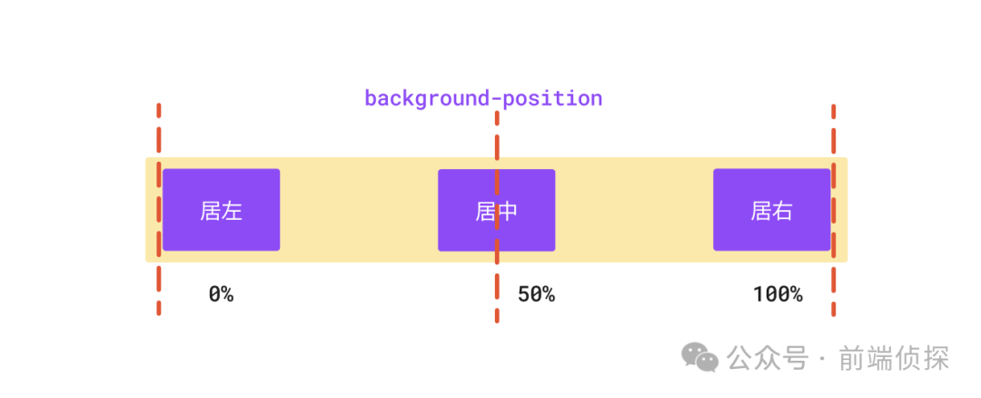
3. Background position changes
This scenario may not be so applicable. If you happen to be operating the position change of the background, you can pay attention to it.
Regarding the percentage of background-position, many friends may have ignored it. This is the official description.
The percentage offset of the given background image position relative to the container. A value of 0% means that the left (or top) border of the background image is aligned with the corresponding left (or top) border of the container, or that the image's 0% mark will be on the container's 0% mark. A value of 100% means that the right (or bottom) border of the background image is aligned with the right (or bottom) border of the container, or that the image's 100% mark will be on the container's 100% mark. So a value of 50% means centering the background image horizontally or vertically, since 50% of the image will be at the 50% mark of the container. Similarly, background-position: 25% 75% means that the left 25% and top 75% of the image will be placed 25% from the left and 75% from the top of the container.
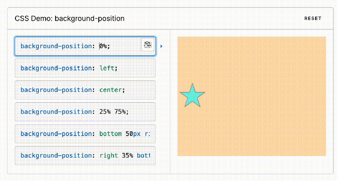
It also has a calculation formula.
(container width - image width) * (position x%) = (x offset value)
(container height - image height) * (position y%) = (y offset value)- 1.
- 2.
It seems complicated, but in fact, you only need to remember one thing. 0% is the far left (top), and 100% is the far right (bottom). There is no need to pay attention to the size of the background.
This is exactly the effect we needed before, and there is no need to consider the offset.
You can watch the demo below:
4. Change the layout idea
Sometimes, if one layout doesn't work, it's good to try another layout idea. Have you learned some of the displacement transition tips introduced in this article? Let’s summarize
- Many CSS properties do not support transition changes, such as the orientation alignment property.
- Conventional alignment cannot achieve transition, and alignment can be achieved in another way.
- The relative positioning left percentage offset is relative to the parent. Directly using 100% will cause it to leave the parent range.
- The translate percentage offset is relative to itself, and using -100% can eliminate the impact of relative positioning.
- Flex layout can use the principle of the container to fill the remaining space to achieve left or right alignment.
- The background position excludes the influence of the background size. 100% means the rightmost (bottom) without paying attention to the size of the background.
[1]CSS align transition(position) (juejin.cn): https://code.juejin.cn/pen/7347208433046650880。
[2]CSS align transition(flex) (juejin.cn): https://code.juejin.cn/pen/7347212824911085579。