Six essential data visualization tools for data scientists, subverting traditional charts!
2024.03.10

In the field of data visualization, scatter plots, bar charts, line charts, box plots, and heat maps are the most common chart types. They are simple to understand and well-known. However, when faced with multiple and complex data scenarios, these standard charts may not be the best choice. In this article, the author summarizes several alternatives to these popular charts:
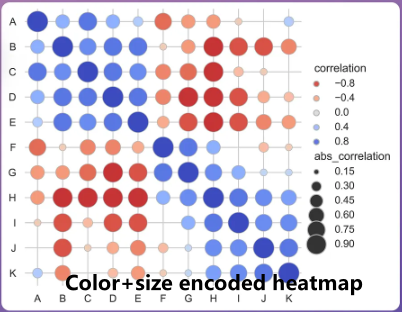
Size-encoded heatmaps
Traditional heat maps usually represent data values through color scales. However, in practical applications, it is still challenging to accurately correspond cell colors to specific values. Dimension-encoded heat maps are an effective alternative. They use the size of graphic elements such as boxes or circles to visually display the absolute numerical size of the data. The larger the size, the higher the value. In this way, not only can the relative differences be reflected through color changes, but the absolute size of each cell value can also be visually displayed through changes in the size of the graph, making the data expression clearer, three-dimensional and easier to understand. As shown below.
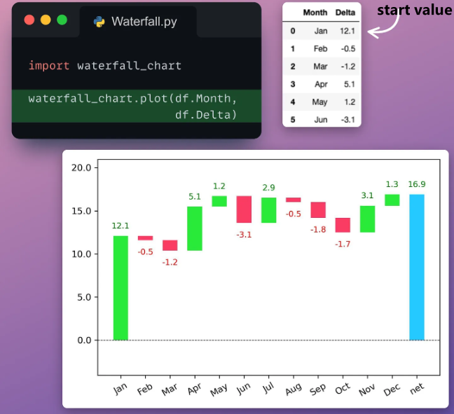
Waterfall charts
To visualize changes in data values over time, it is often preferred to display the actual values on a line chart (or bar chart), but this makes it difficult to visually estimate the magnitude and direction of continuous changes.
Waterfall charts can clearly display data changes in each time period or stage through a cascading layout, describing the rolling differences in data, and are especially suitable for showing the scale and direction of incremental changes.
In a waterfall chart, the starting and ending values are represented by the first and last bars. Through the continuous changes in the chart, the contributions and changes at different stages can be visually observed. Additionally, consecutive changes are automatically color-coded, making them easier to interpret. This design makes the waterfall chart an intuitive and clear tool for presenting changes in data, especially suitable for showing changes in value over time and the impact of each stage on the final result.
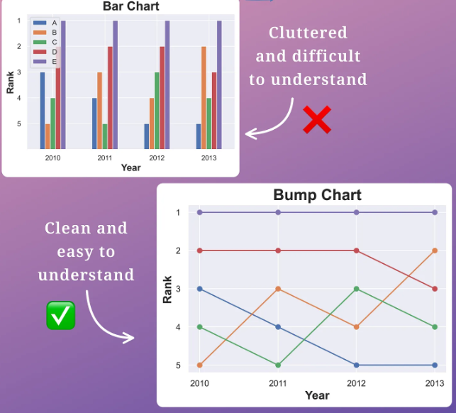
Bump charts
Bump charts are a type of chart used to visualize changes in the rankings of different items over time. When you need to present ranking changes over time for multiple categories, using a bar chart can lead to a cluttered chart. In this case, a bump map provides a clearer visualization.
The bump chart presents the ranking of items in the form of lines, with each line representing the ranking change of an item over time. This visualization of ranking changes can help observers more intuitively understand the ranking changes between different projects. Compared to bar charts, bump charts highlight ranking changes more clearly, reducing the possibility of chart clutter.
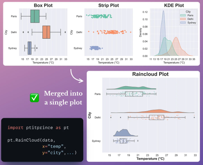
Raincloud Plots
Raincloud Plots is a data visualization tool that combines box plots, strip plots, and kernel density estimation (KDE) plots. It provides a concise yet comprehensive way of displaying data distribution and is designed to address misleading issues that can arise when using traditional boxplots and histograms.
Using the rain cloud diagram, you can:
- Combine multiple figures to avoid false or misleading conclusions;
- Reduce clutter and increase clarity;
- Improve comparisons between groups;
- Capture different aspects of your data with a single plot.
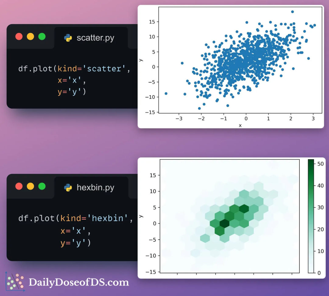
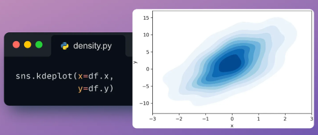
Hexbin and density plots
Hexbin plots and density plots are alternatives for visualizing large numbers of data points, and are particularly useful when a scatter plot's data points are too densely packed and difficult to interpret.
Hexbin plots divide the chart area into hexagonal regions and assign each region a color intensity based on the number of data points in it. This method can more clearly display the density and distribution of data points and avoid visual clutter when data points are too dense.
Density plots, on the other hand, create contours by connecting points of equal density, using contour lines to depict the distribution of data points in two-dimensional space. This presentation method can display the distribution of data more intuitively and help observers better understand the density and distribution patterns of data points.
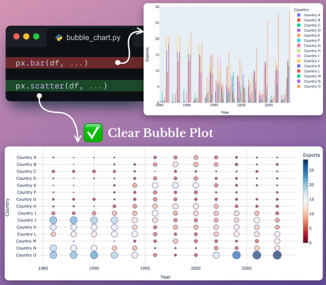
Bubble charts and Dot plots
Bubble and dot plots are effective visual alternatives to bar charts and are particularly useful when presenting data across a large number of categories to avoid chart clutter.
A bubble chart is a chart similar to a scatter chart, but with a categorical axis and a continuous axis. By using the size of the bubbles to represent the value of the data, bubble charts can more visually show changes in data over time.
Dot plots are an alternative to bar charts, emphasizing that we are primarily interested in representing the individual endpoints of total value, while eliminating long bars that are of little use. Both charts effectively solve the problem when a bar chart contains too many bars, making it difficult for the observer to focus on the length of a single bar.